Bold Colour Palettes of 2024: Trendy and Timeless Combinations
Every year, new colour trends emerge, reflecting the shifting moods of society, technology, and design. In 2024, colour palettes are embracing a mix of nostalgia, nature, and future-forward thinking. Whether you're refreshing your home, redesigning your brand, or simply looking for inspiration, these trendy colour palettes can provide the creative spark you need. Let's explore the most popular colour combinations that are making waves this year.
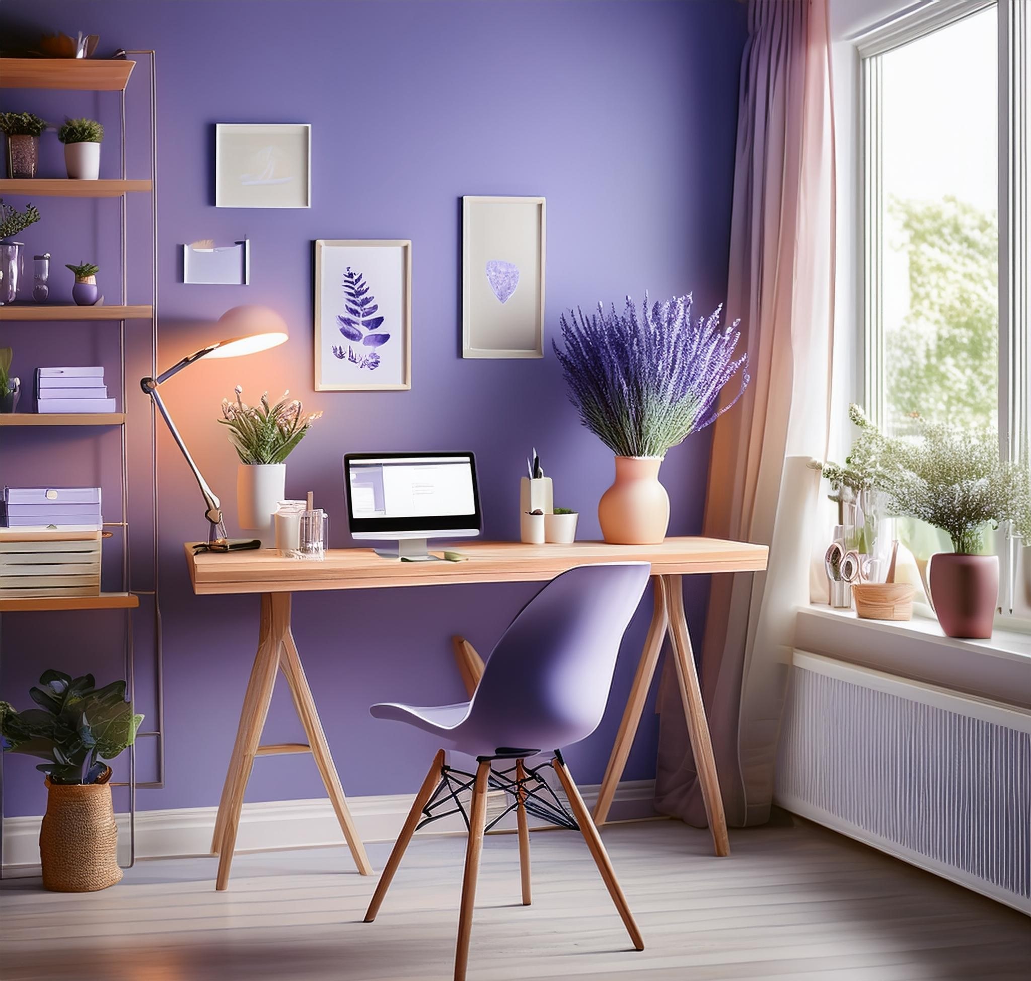
Digital Lavender and Soft Neutrals
2024 sees a continuation of the digital lavender trend, a soft, pastel purple hue that blends the calm of blue with the energy of red. Often seen as a response to the rising need for balance in a digitally driven world, this colour exudes a sense of calm and healing.
Dominant Colour: Digital Lavender
Secondary Colour: Warm Gray or Taupe
Accent: Ivory or Blush
This combination offers a calming, almost ethereal atmosphere, perfect for minimalistic spaces and home offices. Pairing lavender with soft neutrals like taupe or warm gray helps ground the look, while ivory accents add a subtle glow.
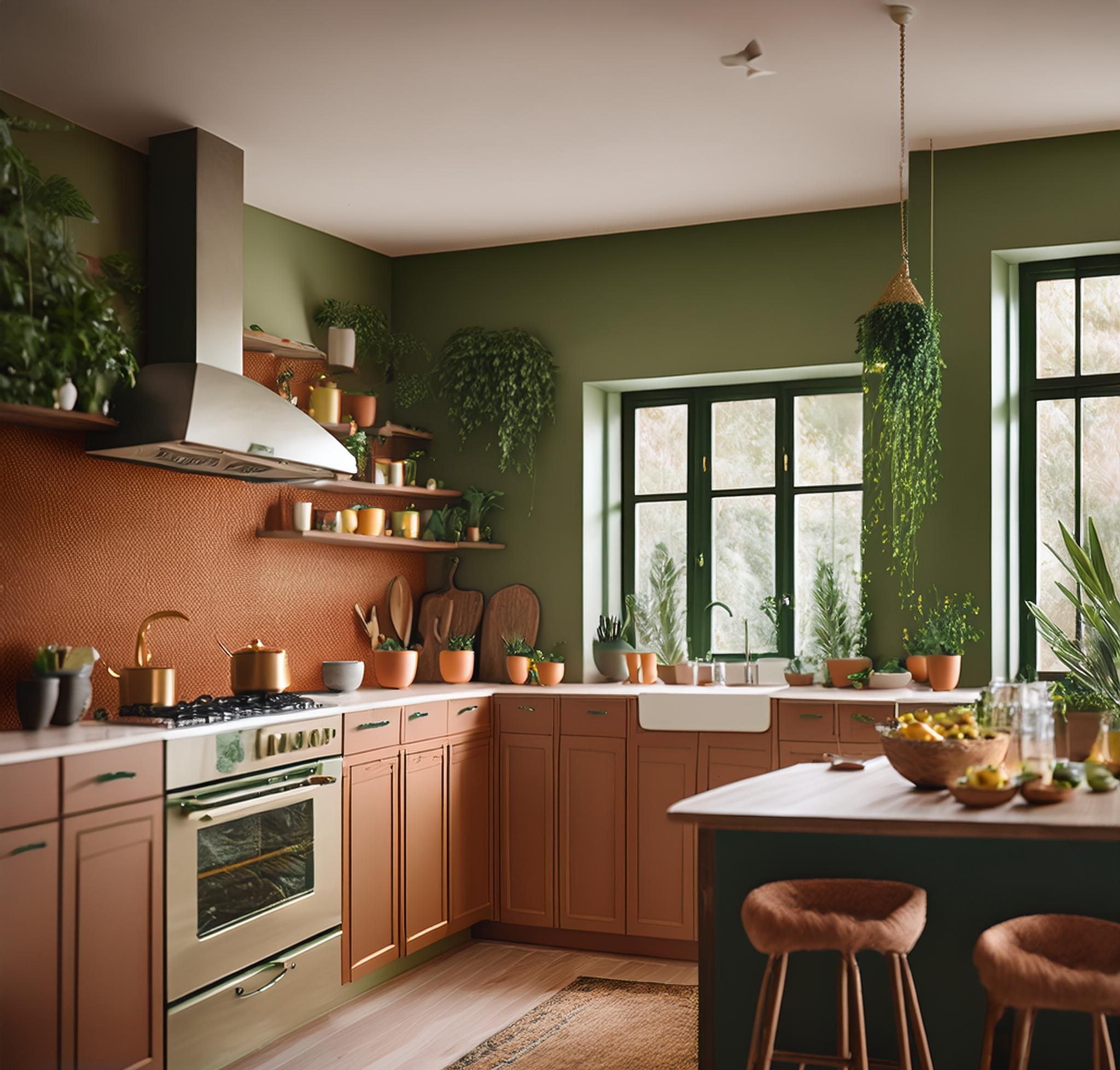
Earthy Terracotta and Olive Green
Earthy tones are making a strong comeback in 2024 as people reconnect with nature and embrace eco-conscious living. Terracotta, inspired by the warmth of the earth, pairs beautifully with deep, organic greens like olive.
Dominant Colour: Terracotta
Secondary Colour: Olive Green
Accent: Muted Gold or Rust
This palette brings a warm, grounded energy to interiors and is ideal for kitchens, living rooms, or any space where comfort and coziness are a priority. Muted gold or rust accents add a touch of vintage sophistication, while still keeping things natural and modern.
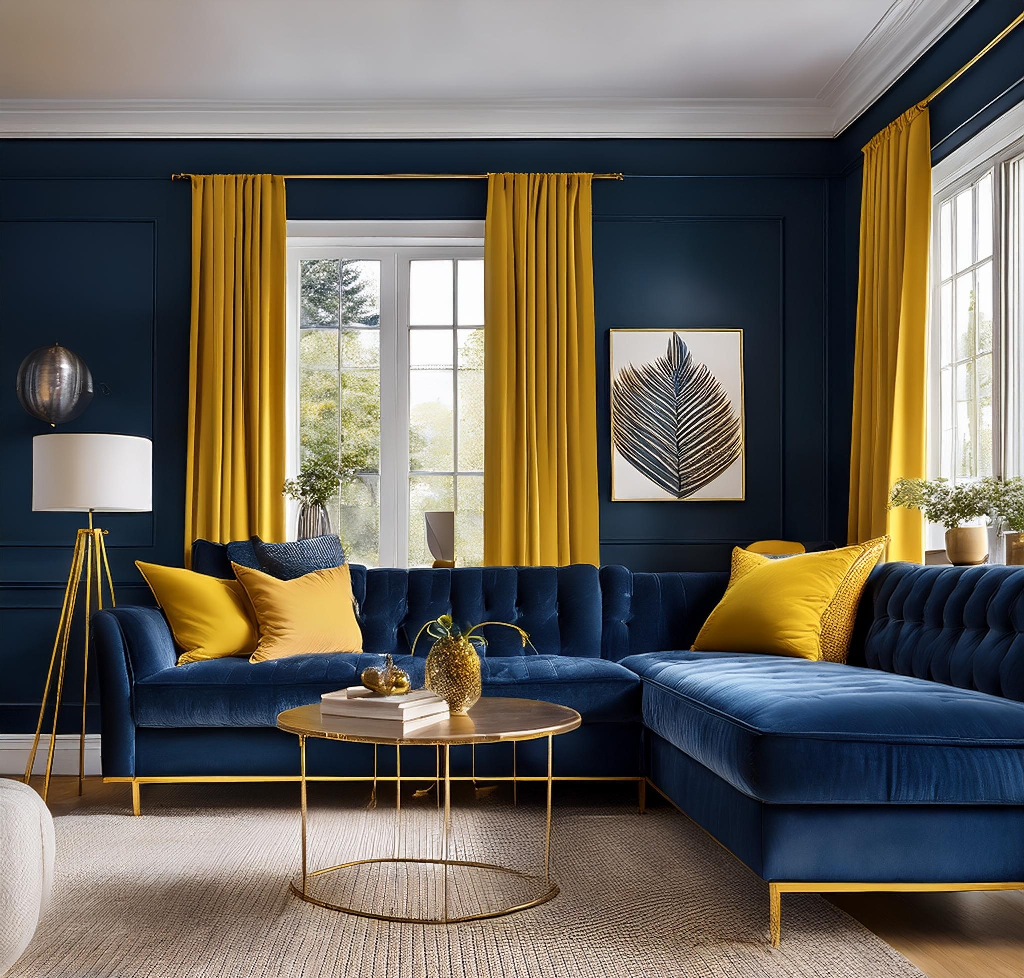
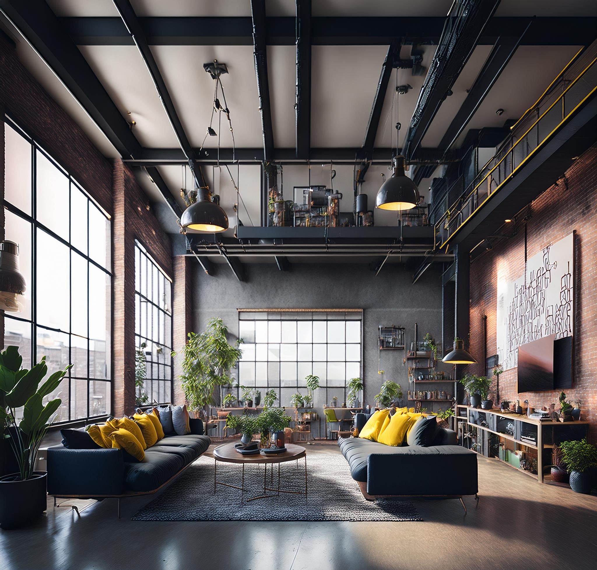
Deep Navy and Mustard Yellow
For those who prefer something bold, yet sophisticated, deep navy paired with mustard yellow is a winning combination.
Dominant Colour: Deep Navy
Secondary Colour: Mustard Yellow
Accent: Cream or Brass
Ideal for modern living spaces, this palette feels both timeless and trendy. The mustard yellow serves as a striking contrast to the deep navy, while brass or cream accents add a layer of elegance without overpowering the boldness.
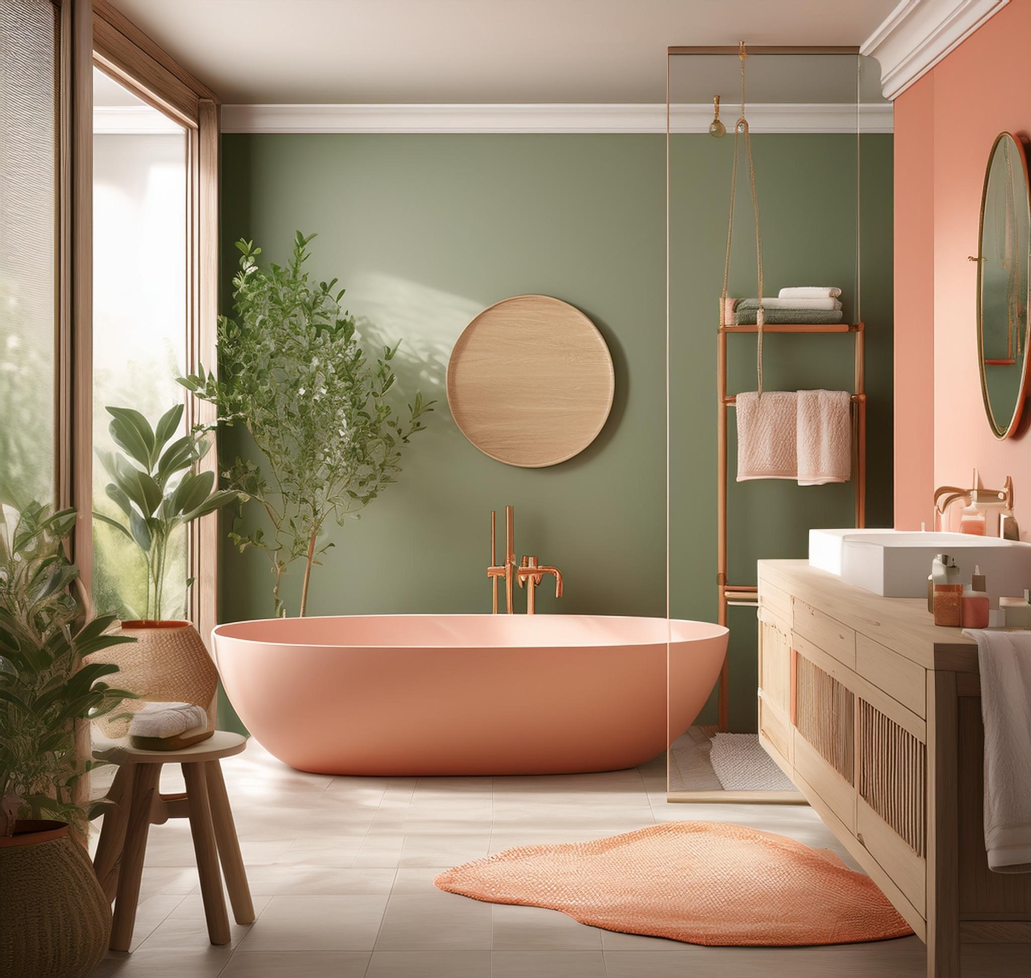
Serene Greens with Coral and Peach
Green continues to dominate the design world, but 2024 is all about pairing soft, serene greens with warmer hues like coral and peach.
Dominant Colour: Sage Green
Secondary Colour: Coral or Peach
Accent: Sand or Light Wood Tones
Perfect for bedrooms, bathrooms, or brands promoting wellness and calm, this palette feels fresh without being overwhelming. The soft green brings a natural vibe, while coral and peach accents inject a touch of warmth. Sand or wood tones complete the look, adding texture and depth.
Monochrome Charcoal with Pops of Neon
Monochrome palettes never go out of style, and 2024 is giving the classic black-and-white look a modern twist with bold neon accents.
Dominant Colour: Charcoal Gray or Black
Secondary Colour: White
Accent: Neon Yellow, Pink, or Electric Blue
This palette is ideal for modern, industrial spaces that want to convey a futuristic, cutting-edge vibe. The neon accents create a striking contrast against the muted monochrome background, giving the design an electric, vibrant energy.
Dusty Rose and Rich Burgundy
For those who love more romantic, timeless palettes, 2024's trending duo of dusty rose and rich burgundy offers a perfect blend of softness and depth.
Dominant Colour: Dusty Rose
Secondary Colour: Burgundy
Accent: Rose Gold or Champagne
Ideal for bedrooms, dining areas, or luxury products, this palette feels rich and sophisticated without being overpowering.
Follow the 60-30-10 Rule
The 60-30-10 rule is a classic design principle that creates a balanced palette:
60% of the space should be a dominant colour.
30% is the secondary colour, which supports the dominant colour and adds interest.
10% is an accent colour, often the boldest or brightest, used sparingly to draw attention to focal points.
In an interior design, think of the dominant colour for walls, the secondary for furniture, and the accent for decor or accessories.
The rule of a perfect colour palette lies in balance, harmony, and intention. By understanding colour relationships, following tried-and-true design principles, and considering the psychology of colours, you can create palettes that not only look beautiful but also evoke the desired emotional response.
Ready to pick your colours? Grab that colour wheel and let your creativity flow!